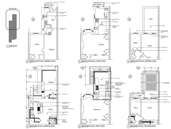
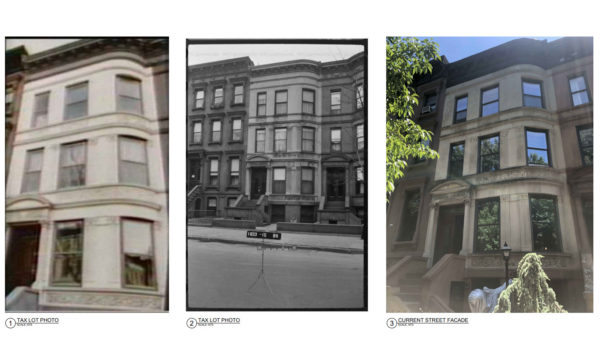
LPC-22-00116
214 Jefferson Avenue – Bedford Historic District
Brooklyn – Block 1833 – Lot 16 Zoning R6B CD: 3
CERTIFICATE OF APPROPRIATENESS
A Renaissance Revival style rowhouse designed by Frederick L. Hine and built c. 1909. Application is to modify a masonry opening and install a balcony and fence.
Architect: ARCHITECTURE + CONSTRUCTION, PLLC
HDC Finds the proposed fenestration at the second floor level to be awkward and inappropriate. At best the design lacks a consistent logic from floor to floor and as a result the overall feel of the rear façade becomes a mish mash. The legibility of the masonry openings on the second and third floor should be maintained – either by simply dropping the sills of the existing openings to the level of the deck – or perhaps combining the two openings on the left side of the second floor into a single wider opening. The Juliette balcony over the existing oriel window of the parlor floor is also unfortunate and crowds the composition. We ask that the commissioners ask staff to work with the applicant to achieve a simpler, more consistent composition.
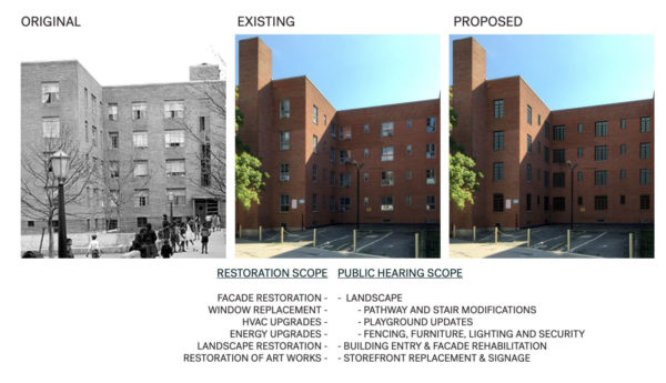
LPC-22-02153
2620 Adam Clayton Powell Boulevard, 2621 Adam Clayton Powell Boulevard, 2641 Adam Clayton Powell Boulevard, 2650 Adam Clayton Powell Boulevard, 70 Macombs Place, 231 – End West 151st Street, 220 West 152nd Street -Harlem River Houses – Individual Landmark
Manhattan – Block Mult – Lot Mult Zoning R7-2, C1-4 CD: 10
CERTIFICATE OF APPROPRIATENESS
A housing project consisting of three groups of buildings and surrounding sites designed by Archibald Manning Brown and built in 1936-1937. Application is to modify landscape elements, install miscellaneous fixtures and signage, and replace doors and storefront infill.
Architect: Curtis + Ginsberg Architects
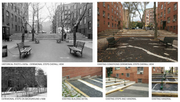
The 1975 designation report for the Harlem River Houses emphasizes the importance of the site’s landscaping, which was designed under the supervision of Michael Rapuano. Today’s proposal ignores the historic significance of this landscaping, and displays a confused mixture of benches, tables, lighting, fencing, and signage. Not only are these elements at odds with the historic fabric of the Harlem River Houses, but they are also at odds with one another. They do not speak a consistent design language, and instead appear as a hodgepodge of items haphazardly selected from a catalogue and tossed into an otherwise thoughtfully considered, historically significant public space.
The benches alone are a prime example. The Preva Urbana benches in today’s proposal appear anemic in scale, unlikely to withstand the demands of public use. Moreover, they lack the warmth and durability of Rapuano & Clarke’s original design. The Vera Solo Curved benches are even worse. In fact, the models in the reference image illustrate how unwelcoming, how unergonomic these curved benches are. The models’ backs are hunched, and their bodies contorted. They would likely be more comfortable sitting on the lawn.
It is no coincidence that Rapuano & Clarke’s various benches continue to appear in parks throughout New York City: their design has yet to be beat. The seating throughout the Harlem River houses should be, if not an exact replica, at least inspired by the original design — something that would be insisted upon were this an historic park elsewhere in the city.
The same can be said for the proposed streetlamps, the design of which is reminiscent of a three-legged spaceship in an H.G. Wells novel, hovering fifteen feet above the ground. Never mind that these fixtures are becoming the norm at other NYCHA properties, the residents of Harlem River Houses deserve better. The historic lamps are more human in scale. They provide warmth and intimacy, creating the feeling of home rather than that of an outdoor sporting arena. Like the original benches, the original lighting fixtures are ubiquitous throughout New York City, and should be restored.
This pattern of specifications expedience also manifests in the proposed signage, which is comprised of backlit extruded lettering. The typeface in the proposed signage is Arial, which is a default font on Microsoft applications and was designed in 1982. This is a lazy design choice — even as a placeholder — say nothing of historically anachronistic. The signage system is oddly reminiscent of a 1990s suburban strip mall, and it has no place in a landmarked property. Instead, the signage should be inspired by the original. There is no shortage of lettering artists in New York who would be equal to the task of interpreting the original designs while meeting the needs of modern businesses. In short: do not revert to default solutions; hire a professional.
Finally, the thoughtful design of the original fencing has been lost. The original Art Deco inspired design is replaced with six-foot tall utilitarian steel panels. These panels are unimaginative, inhumane, and lack historical precedent. The original fencing — with its hierarchical structure — should be restored.